Improve your Business Performance
|
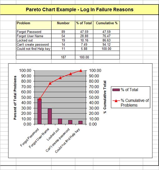
Quality Improvement Pareto Chart ExampleA pareto chart graphically illustrates the 80/20 principle. This is where, for example, 20% of the causes explain 80% of the consequences. The following example below is from the quality improvement area. See below graph for explanation.
As you can see two of the five problems (40%) account for about 80% of the problems. Sometimes the 80/20 rule does not add up to 100%. In this case it is 120%. Often it can be 70/30 or 90/40 or whatever. the ratio really indicates that things in this world are skewed, that
Notice how the 80% cumulative level cuts the red line roughly at the second problem column (40% of the Problems). This chart was made Microsoft Excel.
Go to Top of 'Pareto Chart Example' page
|
